Features
A myriad of module positions This template has 40+ module positions. You don't need to use all of them at the same time, but if you need a position, then it's highly likely that this template has got you covered. More A collection of classes Eleven base classes that can be combined to create an unlimited number of module classes. Want to change the colour of a module? Easily add flavour to your layouts by adding simple to use moduel class suffixes for any of your modules. More. Bootstrap inspired module chrome Create modal windows, tabs, sliders and…
The popover module style replicates the Bootstrap popover functionality - a clickable button that produces a content popover / tooltip when clicked. The module title serves as the text for the popover button while the actual module content provides the content for the popover text. Demonstration Click the buttons below to view the contents of the module.
The slider module style is a group of modules assigned to the same position and given the zentabs module style in the module settings. When there are more than one modules assigned to the same position and given the same zentab style the modules are displayed in a tabbed layout based on the core Bootstrap tab functionality. Demonstration Click the titles below to view the contents of the module.
This is text from another custom html module given the module style - zenslider.
The modal module style replicates the core Bootstrap modal window functionality. When a module is given this module style it will automatically create the necessary markup to display the module title as a button which when clicked will then display the content of the module in a modal window. Demonstration Click the titles below to view the contents of the module in a modal window.
The tabbed module style is a group of modules assigned to the same position and given the zentabs module style in the module settings. The tab triggers are populated by the module title and the tab content is the actual module content. Demonstration Click the titles below to view the contents of the module.
Popular Posts
-
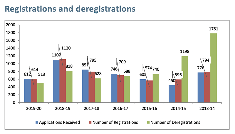
Marriage Celebrants Programme statistics
-
2020 Future Skills Survey - Due 13th Mar
-
All persons who solemnise marriages in A
-
Marriage Celebrants Programme statistics
-
Note: The Client Services Industry Refer
-
Report from Celebrancy Industry Training
Meet the team
No content assigned to be displayed.
This template comes with built in module style / chrome that can be used to implement core Bootstrap component functionality like tabbed layouts, sliders, modal windows and even the pop over display. Granular control over module style One of the key features of Joomla 3.0 is the ability to assign modules a specific module chrome. Prior to Joomal 3.0 each module position was required to have the module style hard coded into the template. There were certain workarounds available for doing this in versions prior to Joomla 3.0 but workarounds to Joomla always come at a cost. Assigning a new…
Portal is a beautiful, clean news portal theme built for Joomla 2.5 / Joomla 3.0 on the powerful T3 Joomla template framework. It's a powerful scaffold to build your next Joomla website on and includes features such as: Complete Bootstrap integration Powerful templating layout tools Easy colour customisation Google font ready Responsive layout and design Multiple module chromes to display modules using the native bootstrap functions such as tabs, sliders, modals and more. A healthy array of typography and module classes using JB Type and built in styling.
The T3 framework also offers an incredible visual tool for controlling the visible appearance of your site. It's a LESS driven templating tool that allows you to create template styles on the fly. Need to change one of the preset styles but don't want to get your hand dirty? No problem ... just fire up Thememagic, change a colour setting, hit save an then you are done.
This Joomla template offers is a responsive, mobile friendly, device agnostic template that offers complete control over the look and feel of your website . The template has been created so that it scales effortlessly regardless of the device the user is viewing the web site on. This means that whether your visitors are mobile or stuck to the desk you and your content look good. Powerful visual tools for determining module layouts. The new T3 framework offers an unprecedented control over responsive layouts. Giving you the ultimate control over the width and type of modules available on 5 different…


